")
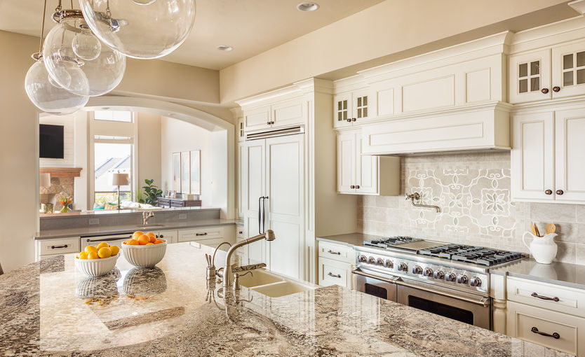
Custom kitchen cabinets and countertops are the foundation of true kitchen design harmony. Designing a kitchen with balance requires more than simply matching surfaces—it’s about curated coordination, intentional contrast, and visual flow that brings cabinetry and countertops together seamlessly.
- Prioritize harmonious coordination by letting either your cabinets or countertops shine—never both—ensuring the space feels intentional and balanced instead of overwhelming.
- Choose coordinated contrast—pairing different yet complementary colors, textures, or patterns—to achieve depth and visual interest without chaos or clutter.
- Match undertones for instant cohesion by selecting cabinet and countertop surfaces with similar warm or cool undertones; this creates a naturally unified look that feels “just right.”
- Use the “hero pattern” principle by making only one surface (cabinet or counter) the visual star, while the other remains understated and supportive for a refined, curated effect.
- Test all samples in your home’s lighting to see how colors and materials interact in real conditions—daylight and artificial lights can drastically change how surfaces appear.
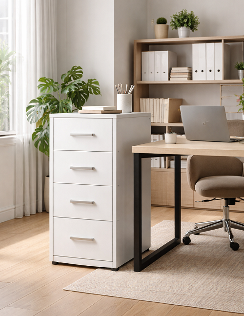
- Invest strategically: Custom cabinetry typically makes up 30–50% of your remodel budget, so balance premium and value materials for lasting satisfaction and strong home resale value.
- Leverage digital renderings and expert input to preview your full palette and make confident final choices; professionals can help you avoid costly coordination mistakes and deliver a result tailored to your vision.
- Balance trends with timeless style—anchor your kitchen with neutral cabinets and introduce personality through accent counter surfaces or hardware for a look that endures both time and shifting design trends.
These guiding principles will help you craft a kitchen that feels unified, inviting, and entirely your own. Dive into the full article for detailed step-by-step strategies, inspiration, and real-world project examples from our custom cabinetry experts!
Introduction
Imagine stepping into a kitchen where every detail feels just right—your eye landing first on elegant, custom cabinetry, then tracing the graceful lines of a countertop that complements without competing. Yet, for most homeowners and designers, finding that perfect balance between cabinets and countertops is where the dream kitchen becomes reality—or falls flat.
Making these surfaces work together—not wage a subtle style war—isn’t as simple as picking two favorite materials. It’s about orchestrating color, texture, and pattern so that the entire space feels thoughtfully curated, not pieced together in haste. Done well, this isn’t just about aesthetics: a harmonious kitchen boosts both timeless beauty and daily function, making every meal prep and gathering feel effortless.
But what if you’re unsure where to start? You’re not alone. Many kitchens miss the mark by:
- Over-matching colors, leading to a flat, uninspired result
- Letting bold surfaces compete, which creates visual chaos
- Neglecting subtle undertones, causing a room to feel “off” without knowing why
As tastes shift toward layered neutrals and strategic contrast, knowing how to pair dominant and supporting surfaces is now essential. The payoff is clear: well-coordinated cabinets and counters elevate your home’s value, maximize usability, and turn your kitchen into the showpiece it deserves to be—now and for years ahead.
In the following sections, you’ll learn how to:
- Create design harmony with “unified but layered” combinations
- Set a visual anchor by choosing which surface leads
- Master contrast, texture, and pattern to make your space feel truly custom
- Relate colors and undertones with confidence for a curated, bespoke look
Ready to discover how custom cabinetry and countertops can bring your vision to life, one perfectly balanced surface at a time? Let’s start by exploring what design harmony really looks like in the heart of your home.
Understanding Design Harmony: Cabinets and Countertops
What Is Design Harmony in the Kitchen?
Design harmony means your kitchen feels like a well-curated space, not a showroom of mismatched parts.
Instead of having cabinets and countertops fight for attention, a harmonious kitchen looks intentional and balanced—every surface works together, supporting your personal style.
Think of it as creating a backdrop for real life, where every detail belongs and nothing feels out of place.
The “Unified but Layered” Approach
True design harmony avoids the flatness of making everything “match.”
- Coordinated contrast (different colors, textures, or patterns that complement each other) creates richness and depth.
- Kitchens where both cabinets and countertops demand attention can feel “loud” and even chaotic.
- Letting one element shine—while the other supports—makes for a space that’s both memorable and easy to live in.
Picture this: elegant white shaker cabinets paired with a bold, deeply veined marble countertop. Each surface tells its own story, but together they create a soothing, beautiful whole.
Setting the Visual Tone: Cabinets vs. Countertops
Cabinetry and countertops anchor the kitchen’s look and feel.
- Cabinets cover about 60% of your visual field. Their color and style set the room’s mood.
- Countertops account for 30%. They provide crucial texture, pattern, and touch—the surface you use every day.
- Hardware and accents fill out the last 10%, guiding the eye and finishing the portrait.
When these surfaces speak the same visual language but stay in their own “roles,” your kitchen feels spacious and expertly composed.
Harmony for Beauty and Everyday Use
A harmonious kitchen is more than pretty—it’s practical.
Matching undertones and contrasts means:
- Lighting feels natural, not jarring
- Surfaces are easy to keep clean and “fresh-looking”
- The space feels calm, not overwhelming, day after day
The most memorable kitchens are unified, layered, and unmistakably personal. When cabinets and countertops coordinate, your kitchen becomes both a relaxing haven and a showpiece for your home.
Your key takeaway: Prioritize coordinated contrast over strict matching. Let one element shine, and watch your kitchen feel instantly more inviting, balanced, and unique.
Establishing Your Palette: Dominant and Supporting Surfaces
Identifying the Star: Cabinets vs. Countertops
To create a kitchen that feels intentional and beautifully balanced, choose one star of the show: your cabinets or your countertops, but never both.
Picture this—sleek white cabinetry offering a calm canvas for a statement island wrapped in swirling black-and-white quartz. Or, imagine rich walnut cabinets quietly grounding a space, while soft matte countertops keep the room feeling breezy.
Here’s how the visual focus typically breaks down:
- Cabinets: ~60% of visible surface area—the natural anchor in most kitchens
- Countertops: ~30%—an excellent stage for drama if you select bold veining or color
- Accents & Hardware: ~10%—the jewelry that ties everything together
When to let cabinets lead:
- Vivid colors, custom finishes, or ornate details deserve the limelight
- Great for smaller kitchens where lots of cabinetry wraps the room
When to let countertops shine:
- Dramatic, high-contrast stone with movement or rich patterns
- Open-concept layouts where long runs of countertop catch the eye
Project example: In a modern farmhouse kitchen, classic shaker cabinets in creamy white frame a statement island surfaced with blue-gray quartz—proving a single focal point delivers instant wow factor.
“Let your kitchen tell one bold story—with either the cabinets or the countertops as the lead character.”
—
Crafting a Cohesive Color Story
A harmonious kitchen starts with a thoughtful, layered color palette anchored by the cabinets and countertops.
Follow these steps for foolproof coordination:
- Pick your dominant surface (cabinet or counter)—this is your palette anchor
- Choose a complementary secondary tone for the supporting surface
- Add accent hues through hardware, backsplash, or lighting
Picture soft gray base cabinets, a pure white quartz top, and champagne-gold pulls. The room feels curated, not chaotic, because each layer has purpose.
“A well-chosen palette is the secret to a space that feels both stunning and serene.”
Current trends show layering neutrals—think warm taupe cabinets with creamy, lightly veined countertops—creates an elevated look that feels at home in any style.
—
Every great kitchen starts with one bold visual anchor and a color story that ties everything together. Deciding which element leads allows your design to sing—without overwhelming the senses.
Mastering Undertones and Color Relationships
Warm vs. Cool: The Key to Cohesion
Every room tells a color story, but kitchens live and breathe undertones. An undertone is the subtle “temperature” behind a color—the golden warmth in cherry wood or the cool, blue-gray cast of Carrera marble.
Selecting cabinetry and countertops with matching undertones is the secret to a kitchen that feels harmonious—not accidental. Pairing warm and cool tones can make a space feel unsettled or disjointed.
- Warm undertones: Think honey oak, maple, cream paint, beige granite, or gold-flecked quartz. They glow in sunlight and feel inviting.
- Cool undertones: Look for gray-wash woods, navy or white-painted cabinets, and stones like snowy quartz or blue-veined marble.
- Designer tip: If your cabinets are a warm off-white, partner with a countertop in taupe or warm gray. If you lean cool—icy blue cabinets or charcoal gray—stick to similarly cool counters for seamless flow.
“When your undertones match, every surface enhances the next—like a perfect harmony in music.”
Large-format samples help: Place a cabinet door and a chunk of your potential countertop in sunlight and see which undertone dominates.
Neutrals and Wood Tones in Pairings
Neutrals are the unsung heroes of kitchen design: whites, taupes, grays, and matte blacks brighten and anchor any palette.
Most custom kitchen designs rely on:
- White cabinets with gray-veined marble or black stone counters (timeless and airy)
- Soft gray cabinets paired with white, silvery quartz or “greige” natural stones (quietly sophisticated)
- Rich wood grains—walnut or rift oak—with honed limestone or subtle veined quartzite for warmth and depth
Wood tones uniquely bridge color gaps. Whether dark espresso, medium walnut, or pale birch, natural wood relaxes the eye and unifies diverse materials. They ground crisp whites or complement dramatic stones.
“Wood brings nature in—every grain tells a story, inviting both warmth and timelessness.”
Remember: even two “whites” can clash if one’s got a yellow undertone and the other a blue. Always test them side by side.
Making Harmony Instinctive
Matching undertones is your quickest win for a cohesive kitchen, no matter the style or scale. Mixing neutrals and wood tones adds flexibility—so your choices feel tailored, not copied. Pulling inspiration from real-world projects, you’ll see that the best kitchens feel right before you even realize why.
The Power of Contrast: Strategic Visual Drama
High vs. Low Contrast Pairings
Contrast is where a custom kitchen truly comes alive. High contrast pairings—think bright white cabinets with jet-black countertops—create show-stopping drama and help define the edges of every surface.
This approach brings energy and clarity, making details pop and spaces feel dynamic. On the other hand, low contrast designs—such as soft gray cabinets with warm veined marble counters—deliver a serene, seamless look that feels quietly sophisticated.
Here’s a quick decision guide:
- High contrast adds definition and suits modern, industrial, or bold contemporary styles.
- Low contrast fosters calm and continuity, perfect for traditional, transitional, or minimalist kitchens.
- In smaller kitchens, low contrast can visually expand the space, while high contrast can add “wow” in larger, well-lit rooms.
“Contrast is your best tool for either drama or subtle sophistication—choose it with intention, not by accident.”
Repeating Contrast for Balance
A compelling kitchen balances contrast across every surface—not just between cabinets and countertops. Consistent contrast logic connects floors, backsplashes, and accents for a unified feel.
Use these real-world strategies:
- If cabinets and counters are highly contrasted, keep the backsplash and flooring more understated.
- Repeat the same contrast logic throughout: try dark floors with pale cabinets and mid-tone counters for balanced layering.
- Soft contrast everywhere offers a soothing effect, while a single element with decisive contrast can become a “hero moment.”
- Data shows designs that repeat their contrast ratio across the room are rated more cohesive by clients and designers alike.
“A room where contrast is thoughtfully echoed—from cabinetry to backsplash—feels curated and don’t just ‘match.’”
Picture this: Natural light pouring over pale shaker cabinets, the eye drawn to a veined charcoal quartz counter, echoed subtly in the matte black hardware.
Applying Contrast for Cohesive Impact
Contrast isn’t about chaos—it’s about creating movement and focus. Layering contrast thoughtfully prevents a cluttered or overwhelming vibe.
Start by identifying your standout surface—cabinet or counter—and let the other elements support that lead. If in doubt, pull your contrasting shade from a finish already present in the room for built-in harmony.
Every kitchen tells a story through its use of contrast. Whether you seek bold definition or soft fluidity, consistency in your contrast choices brings out the best in both your cabinetry and countertops. Remember, visual drama doesn’t require excess—just the right balance.
Texture, Pattern, and Visual Interest
The “Hero Pattern” Principle
Every kitchen needs a focal point, and the “hero pattern” principle keeps your design feeling refined—not chaotic.
Choose only one surface as the visual star. If your countertop features busy veining, bold movement, or a statement color, let the cabinets take a supporting role with a solid or subtle finish.
When cabinets have ornate details, deep colors, or unique grain, opt for a quieter countertop—think smooth quartz, minimal marble, or ultra-matte stone.
- Do: Pair dramatic, patterned quartz or granite counters with simple shaker or flat-panel cabinet doors.
- Don’t: Combine ornate cabinet doors with high-contrast, heavily veined stone—this makes the space feel cluttered.
Picture this: a waterfall marble countertop with dramatic veining becomes the showstopper, set off by clean, matte white cabinets that let the stone’s artistry shine.
“One hero, one supporting player—never both.” This design mantra makes even small kitchens feel curated and balanced.
Mixing Materials and Textures
Don’t overlook the impact of texture. Today’s kitchens blend high-gloss, matte, honed, and natural wood finishes for depth and tactile interest.
Here’s how you can layer looks for a custom result:
- Glossy cabinets + honed or mattified counters: High-gloss lacquered doors with soft, velvety quartz or concrete counters catch the light and minimize fingerprint marks.
- Wood-grain cabinets + polished stone: Warm, textured walnut or oak with a sleek, reflective countertop delivers rich contrast—a favorite in modern renovations.
- Matte cabinets + textured stone: Understated painted or thermofoil fronts paired with subtly textured granite or quartzite create a quietly luxurious vibe.
A recent IL Cabinets project mixed matte charcoal cabinetry with lightly veined, glossy white quartz counters—the result: a kitchen that feels contemporary but never cold.
Photographing these combinations in natural light reveals the interplay between surfaces, which is why designers recommend snapping a few shots before final selections.
Unlocking Your Kitchen’s Visual Potential
Balancing pattern and texture is a secret weapon for designers—and a major reason custom kitchens stand out.
For a kitchen you’ll never tire of, let one feature lead, support with restrained finishes elsewhere, and don’t forget: “Texture is just as memorable as color.”
Try sample pairings at home, photograph them under different lighting, and notice which combinations feel welcoming and put-together.
A kitchen that layers pattern and texture wisely will always feel harmonious, sophisticated, and totally your own.
Relating Colors Without Replicating
Creating a kitchen that feels both unified and inspiring means linking your cabinets and countertops without falling into the trap of copy-paste matching.
A well-composed color story is about coordination, not duplication—a subtle art that gives your kitchen its tailored charm.
Build Connection Through Inspiration, Not Imitation
Instead of matching colors exactly, look for subtle ways to pull inspiration from your countertop’s secondary hues or veining.
For example:
- If your quartz countertop has delicate blue-gray veins, sample a soft blue-gray for your cabinet paint instead of going for the main white base.
- With a warm marble countertop, echo a hint of the soft taupe from its graining in your cabinet finish for a harmonious, layered effect.
This approach lets you “relate” your surfaces while keeping the visual experience dynamic and intentional—avoiding the flatness of direct repetition.
Social-ready snippet:
“Pull a cabinet color from a veining accent—not the main countertop shade—for a designer’s touch.”
Use Depth, Tone, and Sheen to Prevent Monotony
Keeping colors in the same family certainly feels safe—but it can make your kitchen blend together, lacking both interest and warmth.
Prevent monotony by varying:
- Depth: Pairing a pale gray cabinet with a charcoal countertop maintains connection without sameness.
- Tone: Mix warmer beige cabinetry with a cool concrete-look countertop for subtler, tailored contrast.
- Sheen: Offset matte cabinets with glossy counters (or vice versa) for a tactile, high-end look.
Trending detail: 68% of today’s remodels feature cabinets and counters in related but distinct hues, rather than one-note matching.
Visual Linkage: Your Designer’s Shortcut
Instead of chasing an exact color match—which can backfire as lighting changes—aim to:
- Repeat accent colors from veining, not the background
- Shift texture or finish when tones are similar
- Relate wood stains to subtle flecks in engineered stone for instant cohesion
Picture this for video or testimonial: swatches in soft gold, taupe, and cream laid side-by-side, interplaying without blending, set against a dramatic stone slab—proof that thoughtful variety beats forced uniformity every time.
When you layer related colors using depth, inspiration, and contrast, your kitchen radiates the quiet confidence and custom craftsmanship that set great design apart. This not only ties your kitchen together visually but keeps every surface feeling like a bespoke, intentional choice.
Adapting Harmony to Style and Mood
Traditional Kitchen Pairings
Classic kitchens thrive on rich detail and layered elegance.
Think raised-panel or beaded cabinet doors in warm woods or creamy paints—these anchor the space with timeless appeal.
Real stone countertops, such as marble or honed granite, often join the mix.
Pairing options include:
- White or cream cabinets with subtle-marble pattern quartz
- Cherry or walnut cabinets with deep-beige or earth-toned granite
- Antique brass hardware tying both elements together
“With intricate cabinetry, let your countertop be the canvas—choose a stone with gentle veining rather than bold movement.”
Photography idea: Close-ups of ornate crown molding and a softly veined marble island, bathed in natural morning light.
Contemporary and Modern Approaches
Modern kitchens trade ornate features for sleek lines and seamless surfaces.
Flat-panel cabinets—often in soft matte white, deep charcoal, or pale wood—bring the focus to clean geometry.
Pair with ultra-smooth counters:
- Quartz counters in solid white, jet black, or concrete-look greige
- Glossy slab cabinetry for high reflectivity, or rich matte for a calming vibe
- Minimal hardware in black or brushed nickel
“Modern harmony is about restraint—one statement surface, one supporting act.”
Use high contrast—like white cabinets with dark counters—or go low-contrast for a quietly sophisticated look that trends on search boards everywhere.
Transitional and Hybrid Designs
Transitional kitchens blend classic warmth with crisp simplicity.
Picture shaker-style cabinets in soft grays or taupes, paired with lightly veined quartz for a balanced, approachable look.
Your formula:
- Shaker cabinets in a gentle, muted color
- Quartz or granite with subtle patterning
- Mix of warm metals (like muted gold pulls) for friendly undertones
“Transitional design is where tradition meets today—a style made for homes that want both comfort and freshness on one canvas.”
Showcase grouped cabinet doors with sample slabs and hardware for an instant, shoppable story.
Across all styles, remember: balance bold and subtle, layer your textures, and let one finish take the lead. This is how kitchens feel crafted—not just constructed.
The Real-World Test: Viewing Samples and Making Final Choices
Sampling in Your Actual Light
Design harmony starts with seeing—literally—how your chosen materials play together in real life.
Never decide from a website or showroom alone. Bring physical cabinet door samples and actual countertop slabs into your kitchen before finalizing anything.
Why? Lighting changes everything. Natural daylight can make tones feel brighter and truer, while artificial lighting (especially warm LEDs) shifts colors warmer or cooler than you expect.
Picture this: You love a soft gray cabinet and marble counter at the showroom, but at home, the gray suddenly looks blue and the marble’s veining pops more than you bargained for under your under-cabinet LEDs.
Immediate action for peace of mind:
- Gather all major samples—cabinetry, countertop, flooring, and backsplash—together in your kitchen.
- Place them side by side near windows and under the kitchen lights you’ll actually use.
- Notice how the colors and patterns shift at different times of day.
“A five-minute lighting check now saves years of ‘what did we do?!’ later.”
Expert Consultation and Customization
Don’t go it alone—invite a pro’s trained eye. Working with a designer or custom cabinetry specialist unlocks options you may not see on your own.
Quick benefits to expert support:
- Professional sample selection: Experts know which undertones clash or complement—avoiding costly mismatches.
- Custom fabrication means both cabinets and counters can be tailored to your space for a perfect fit and finish.
- Many design firms (like IL Cabinets) offer digital renderings or detailed mockups, letting you preview the entire “combo” before a single board is cut.
Visual scenario: Imagine a digital rendering of your dream kitchen, showing your selected cabinet hue with veining from your exact slab selection. You can “walk through” the look before committing.
“See your vision in full color before the tools ever come out—mockups bring your new kitchen to life.”
Making Confident Final Choices
Budget your time for thoughtful, hands-on reviewing of ALL surfaces—don’t just rely on screen colors or small swatches.
Letting both natural and artificial light play across your chosen samples, get input from family or design pros, and use digital visualizations will ensure your remodel is cohesive, stunning, and truly “you.”
The most beautiful kitchens happen when every surface is chosen together, with eyes wide open—literally.
Navigating Costs, Trends, and Value Considerations
Budgeting and Value Decisions
Custom kitchen cabinets and countertops range widely in price, with costs shaped by materials, design complexity, and level of customization.
On average, custom cabinetry can represent 30–50% of a kitchen remodel budget. Countertop costs vary: quartz and granite typically range from $60–$150 per square foot installed, while premium woods and high-gloss finishes for cabinets can add significantly to the price.
When deciding between premium vs. value materials, consider:
- Premium materials (like solid hardwoods or natural marble) offer exceptional durability and long-term satisfaction but come at a higher upfront cost.
- Value alternatives (such as thermofoil cabinets or laminate counters) stretch budgets but may require earlier replacement or show wear over time.
- Smart pairings—such as upgrading countertops while choosing a classic painted MDF cabinet—can offer the best of both worlds.
Investing in design harmony isn’t just about aesthetics—homes with coordinated, quality cabinetry and counters consistently retain higher resale value. “A kitchen that feels cohesive tells buyers you’ve invested in the heart of your home.”
Current Trends and Timeless Choices
Design trends fluctuate, but harmony endures. According to recent data, the most searched kitchen looks are:
- Soft neutrals: Warm white or taupe cabinets paired with veined quartz counters.
- Bold contrast: Deep charcoal lower cabinets against creamy marble or white quartz tops.
- Mixed textures: Matte cabinetry finishes combined with polished, stone-like surfaces.
To balance of-the-moment trends and timeless style:
- Anchor the space with neutral cabinetry—then introduce trend-forward counters or backsplashes that are easier to swap in the future.
- “Picture this: crisp white cabinets with a dramatic black soapstone counter—classic, yet always current.”
- Steer clear of overly trendy colors for main surfaces unless you truly love them.
At IL Cabinets, we blend artistry with function by:
- Custom color-matching cabinets to subtle countertop veining for truly one-of-a-kind results.
- Providing digital renderings so clients can preview realistic pairings before committing—a must for modern decision-making.
- Sourcing innovative, durable materials, ensuring beautiful looks that stand the test of time.
Small decisions on cabinets and counters have a lasting impact—well-coordinated surfaces elevate daily experiences and boost long-term home value. Prioritize what feels true to your style, and invest in combinations that will endure both trends and time.
Learn more about our craftsmanship on our About Us page
Conclusion
Designing a kitchen where custom cabinets and countertops work in true harmony transforms your space from ordinary to extraordinary—balancing beauty, function, and personal expression.
When every surface speaks the same visual language, your kitchen becomes more than a workspace; it becomes a daily source of comfort and inspiration.
Take these key ideas into your own project:
- Establish a clear visual focus—let either your cabinets or countertops shine, not both.
- Prioritize undertone matching for seamless harmony and a naturally inviting atmosphere.
- Layer colors and textures with intention rather than imitation for a tailored, designer look.
- Test samples together in your actual lighting before finalizing any choices.
- Consult with cabinetry professionals for guidance, custom solutions, and confidence every step of the way.
Ready to take action?
- Gather physical samples of your favorite cabinets and countertops and view them side by side at home.
- Snap photos in daylight and under your kitchen’s lighting to reveal natural undertone relationships.
- Reach out to a trusted design consultant or custom cabinetry specialist for expert advice and a personalized rendering of your new kitchen.
- Set up a meeting and bring your color ideas, inspiration photos, and must-haves—you’ll unlock options and insights you never considered.
Each decision you make is a brushstroke on the canvas of your home.
Design harmony isn’t just about matching surfaces—it’s about crafting a space that feels alive, welcoming, and unmistakably yours.
Your kitchen’s transformation starts with one inspired choice. Start today—and watch your vision become reality.
According to NKBA Kitchen Design Guidelines, visual balance between cabinetry and countertops improves both function and resale value.
Explore our full guide:Custom Made Kitchen Cabinets: Design, Styles & Features
FAQs
1. What are custom kitchen cabinets and countertops?
Custom kitchen cabinets and countertops are made-to-order kitchen components designed specifically for your space, style, and functional needs. Unlike stock options, they offer personalized materials, finishes, sizes, and layouts for a cohesive, high-end kitchen design.
2. How do custom kitchen cabinets and countertops improve design harmony?
Custom kitchen cabinets and countertops improve design harmony by allowing precise coordination of colors, undertones, textures, and proportions. This ensures one surface leads visually while the other supports, creating a balanced and intentional kitchen aesthetic.
3. Should cabinets or countertops be chosen first in a custom kitchen?
In most custom kitchen projects, cabinets are chosen first because they occupy the largest visual area and define the kitchen’s overall style. Countertops are then selected to complement the cabinet color, undertone, and design focus.
4. What materials work best for custom kitchen cabinets and countertops?
Popular materials for custom kitchen cabinets and countertops include solid wood, MDF with premium finishes, quartz, granite, marble, and quartzite. The best choice depends on budget, durability needs, and desired visual impact.
5. How much do custom kitchen cabinets and countertops cost?
Custom kitchen cabinets and countertops typically account for 30–50% of a kitchen remodel budget. Costs vary based on materials, craftsmanship, finishes, and complexity, but they offer strong long-term value and resale appeal.
Table of content
- 1. What are custom kitchen cabinets and countertops?
- 2. How do custom kitchen cabinets and countertops improve design harmony?
- 3. Should cabinets or countertops be chosen first in a custom kitchen?
- 4. What materials work best for custom kitchen cabinets and countertops?
- 5. How much do custom kitchen cabinets and countertops cost?